
The Art of Autumn Color: The Full, Unabridged Guide
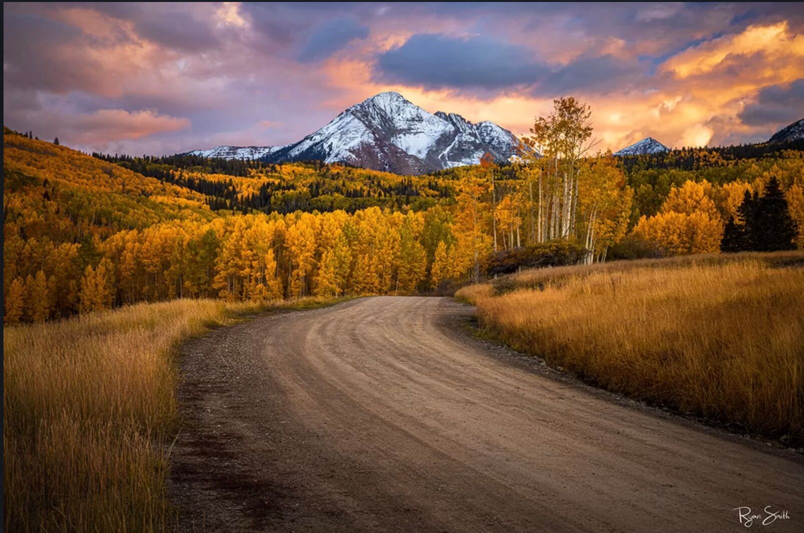
Fall is officially here, and we’re making the most of it.
This week, we’re hitting the trails throughout northern Utah to photograph fall colors as the aspens begin to turn, then heading to Colorado to guide our Telluride Fall Colors photography workshop.
If you’re grabbing your camera and heading out for a little leaf peeping of your own, this is a great time to brush up on fall color photography techniques - from finding the best light and compositions in the field to bringing those autumn colors to life when you edit.
The Full “Art of Autumn Color” Article
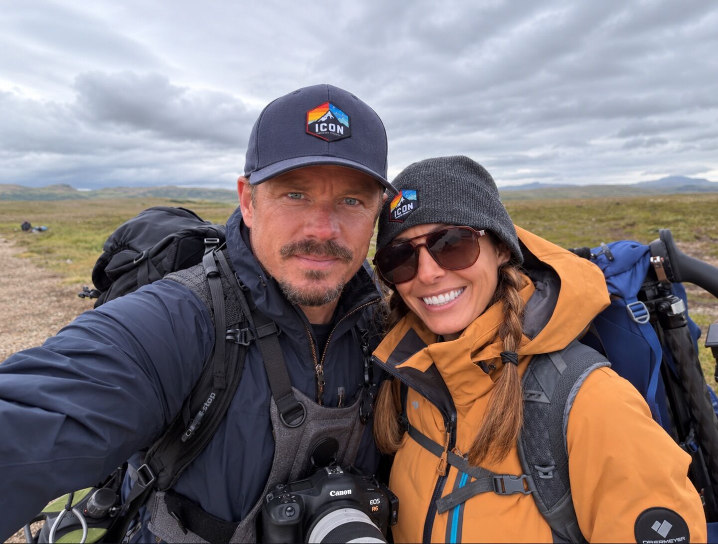
Earlier this year, we shared the story behind our Outdoor Photographer feature, The Art of Autumn Color, along with a look at the collaboration that brought it together. The magazine ultimately published an eleven-page version of the piece, pairing Ryan’s photography and experience in the field with Lindsay’s writing.
But, as often happens in publishing, the original article was longer.
So, with fall color arriving around us once again, we thought this was the perfect time to share The Art of Autumn Color in its entirety—the original, unabridged article.
Author: Lindsay Marie Zingg
@lindsaymariezingg
I live in the Sonoran Desert, where autumn barely exists beyond a slight cooling of the air and the occasional yellowing of a cottonwood tree. It takes real effort for me to find it - long drives, careful timing, and a bit of luck. So my disappointment was real when I returned from the mountains last fall to find my images were, well, a bit unremarkable. What had gone wrong?
Ryan Smith’s work has been something I’ve puzzled over and studied for a few years now. And a recent friendship between us has made the process of finding out how he does it much easier. Ryan is a wealth of information when it comes to photography, and he never holds back from sharing what he knows. But Ryan also doesn’t approach editing the way many photographers hope he does; there is no sacred flowchart for him. In many ways, his entire philosophy seems rooted in resisting rigid outcomes both in photography and in life. I knew whatever advice he had to give would move outside sliders and perfect framing, so with my own photographs at the ready, I gave him a call.
His first words of advice? “I’d rather spend 4–5 hours editing one image to get it to an amazing place than edit 4–5 images. I don’t think a lot of photographers take a single photograph far enough - and that’s what makes the difference. If they would just take it a bit further.”
But for a man committed to being so non-committed, what did “further” mean?
When many photographers approach editing, they often begin with a fixed objective in mind - to share with the public what they saw in the field. But Ryan lets go of that completely, allowing the image to go where it wants to go. Still, working in Lightroom, he begins at the top, viewing the image in the landscape profile, deciding whether the boost in color benefits the photograph or not. He then adds slight global warmth, tint, vibrance, or saturation - starting the dance between colors. After that, he dives heavily into individual HSL colors within the mixer. But where many photographers stop at hue and saturation adjustments, Ryan keeps going.
“For yellows and reds, my secret is I pop the luminance,” he told me. “Especially for fall colors. Popping luminance and then adding global contrast really does something amazing.”

I jumped into Lightroom and clicked on one of my disappointing fall photographs and started doing just that.
“Go on”, I urged him. I could tell he was just warming up, and was about to reveal more.
“Learning how to accentuate or add light that wasn’t in the photograph is really important - especially for fall photography.”
But that didn’t mean increasing the highlights or whites. First, he had me darken my entire image globally, beyond what I would have ever thought to do.
“Okay, now I want you to create a new color range mask with the eyedropper, and then boost the exposure on it.”
I selected one of the softer orange midtones and clicked, gently lifting the range’s exposure as the image came alive. I sat back, surprised by how simple yet effective it was.
We took a short break, but my mind kept circling. Fall is a kaleidoscope of contrasts changing day by day, week by week, with every turn of the scope. Fading greens beside fiery oranges. Golden yellows interrupted by black-and-white bark.
“We’re looking for contrasts out there, aren’t we?” I asked him when we returned to the conversation later that day. “I can see that in your images.”
He shifted immediately into color theory.

“The human eye gravitates to yellows and oranges out of the color spectrum first,” he explained. “Oranges, reds, and yellows are marketing colors - they pop, they catch the eye. Fall makes for some of the most successful images on the market. It boosts portfolio engagement.”
“So is that why you shoot a lot of fall images?” I cajoled.
He laughed good-naturedly.
“Besides the marketing potential, I just love the fall. The campfire even smells different. Love, love a good fire. In the fall, there’s a strong smell of decomposing leaves. Strong and beautiful smell. Beyond that, season change is a personal thing to me. When things grow, and the life cycle comes to an end, they become their most beautiful - right before they fall.”
Ryan and I were both in seasons of transition in our lives, so I wasn’t surprised the conversation was turning philosophical. It’s hard not to see the human element in the fall, the invitation to let go, dropping ideas or beliefs that may have once served us, but no longer do, seeking a benediction on a time of rest to prepare for new growth. Is it any wonder we head to the trees when the temperature changes?
“Ever heard of the word petrichor?” Ryan continued. “It’s that musky fragrance produced when raindrops hit the soil. You actually don’t smell the rain when it rains; the smell is from what it’s hitting.”
Then he paused.
“I wonder what the connection is between petrichor and mildewy dying leaves?”
I considered quickly looking it up, but petrichor was only a short digression.

Leaving the detour behind to return to the concept of contrast, Ryan reframed the way I was thinking about color, explaining that too much variance can be confusing to the eye. “You don’t want a whole rainbow in a photo,” he warned. I was surprised to hear it, and jumped back onto his website to better understand. Ryan’s most striking fall images work because they’re restrained by deep blues, purples, blacks, and shadow. Too many differing fall colors, and you dilute the impact of the scene.
But at least as far as my aspen photos were concerned, I didn’t have a color issue. Quickly sending over a couple of my files, I now needed to know what had gone wrong with my composition.
Aspens are one of the hardest things to photograph well because forests naturally become chaotic very quickly on camera. Ryan pointed out that my photos were trying to say too many things at once, explaining that the strongest compositions usually feel intentional and breathable. They simplify the chaos instead of trying to include all of it.
“One thing I constantly look for is larger trunks with separation between them. I’m almost treating the trunks like graphic design elements or brush strokes instead of just documenting a grove of trees. Repetition, rhythm, spacing, and negative space become huge. Tiny movements left or right or changing focal length can completely change how trunks relate to each other.”

For a successful forest scene, immersion is critical; humans long to enter a forest, not just stand on its edge. A telephoto lens invites us into the scene, compressing the distance between tree trunks and allowing the photograph to be distilled into more eye-pleasing patterns. By contrast, a wide-angle lens amplifies the space between trees, often removing the feeling of proximity.
Ryan offered some final words of advice. “Honestly, I think the biggest thing is this. It comes down to finding a grove that naturally fits compositionally rather than trying to force any grove to fit.”
We had successfully taken my fall photographs from emotionally lackluster to sparkling with energy, and the lessons in luminance had been a large part of that. There wasn’t much more I could do to correct my compositional mistakes beyond returning for a reshoot when the temperatures changed. For now, I felt more confident that the drive from desert to mountains would yield far better results. And if I failed again? Well, I always had petrichor.
Much of what I learned on the call that day came from having access to a professional as I worked through my own images. Helping others in their photography journey is part of what Ryan Smith does. Beyond offering worldwide photography tours, his company offers editing flow weekend retreats, where he and other industry leaders provide instructive sessions, and one-on-one editing support in both Lightroom and Photoshop.
Thanking Ryan for all I had learned that day, I asked for one more piece of advice. “If I go to print one of these images, what can I do to ensure all the work I did in pre and post doesn’t get lost on acrylic or paper?”
He kept it simple. “Saturate a little heavier than on screen, so increase the brightness around ten percent, increase the saturation, and maybe the vibrancy too.”
Then he laughed.
“I like sauce on everything. Give me a big old side of ranch and barbecue sauce, and I am just going to drench my food in it - just add a shit-ton of sauce. For me, I don’t care how it looked out there when I’m shooting; I’m creating a dream.”

Shrouded in soft morning mist, Visions and Dreams of Neuschwanstein captures Germany’s most iconic castle rising above the forests of Bavaria in a moment of pure stillness. Autumn colors and drifting fog wrap the fairy-tale towers in atmosphere, creating a dreamy scene pulled straight from a storybook. Designed for luxury homes, European-inspired interiors, and refined contemporary spaces, this fine art piece brings magic, warmth, and a timeless sense of wonder to any room. Offered as a Luxury Metal Print or Museum-Grade Acrylic for maximum depth and clarity.